The rainbow flag has become the most prominent symbol of the LGBT+ community and can be seen anywhere from shop fronts to the flagpoles of government buildings. It originated out of a desire to move away from the pink triangle that had been reclaimed after WW2, during which the Nazi regime used the symbol to brand homosexual and bisexual men and trans women, as well as assigning it to rapists and paedophiles. Some activists wanted to move away from using the symbol so that the community could be free of this Nazi tool of oppression.
Gilbert Baker, a gay rights activist and veteran, became known for creating banners for gay rights and anti-war protest marches. It was through this that he met and befriended the San Francisco community leader Harvey Milk in 1974. Milk encouraged Baker to create a new design for the LGBT+ community and, in 1978, he created the Rainbow Flag.
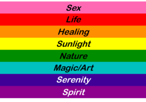
The first iteration of the flag had eight stripes, each colour having an assigned meaning. The colours from top to bottom were hot pink, red, orange, yellow, green, turquoise, indigo, and violet.
In response to the assassination of Harvey Milk on 27 November 1978, demand for the rainbow flag soared. The Paramount Flag Company capitalised on this increased demand and started selling a version of the rainbow flag using stock rainbow fabric with seven colours: red, orange, yellow, green, turquoise, blue, and violet. Baker increased his own production of the flag and also dropped the hot pink stripe due to a lack of availability of the hot pink dye.
Soon after, the flag was modified again for the 1979 San Francisco pride parade. Organisers wanted to be able to split the flag in two so that it could cover the two sides of the parade route and to do this, an even number of colours was needed. The turquoise and indigo stripes were merged into a royal blue stripe, creating the six-colour rainbow flag we recognise as the modern LGBT+ rainbow flag.
As the LGBT+ community became more established, various groups within it began to search for their own symbols so that their own identities could be easily recognised. A small selection of these are discussed below.
Bisexual Flag
The Bisexual Pride flag, designed in 1998, took inspiration from the biangles (bisexuality triangles) that had been previously used by the bisexual community. The biangles symbol comprises a pink equilateral triangle and a blue equilateral triangle, where a small portion of the triangles overlap and the overlapping portion is coloured purple. The blue colour represents opposite-sex attraction; the pink represents same-sex attraction; and the overlapping purple represents a combination of these.

The bisexual flag takes this concept to form a flag having pink, purple and blue stripes in a ratio of 2:1:2. The lead designer for the flag, Michael Page, said of this arrangement: “The key to understanding the symbolism of the bi pride flag is to know that the purple pixels of color blend unnoticeably into both the pink and blue, just as in the ‘real world,’ where bi people blend unnoticeably into both the gay/lesbian and straight communities.”
Trans Flag
The most commonly used flag design for representing the trans community is the Transgender Pride Flag. Designed in 1999 by trans woman and activist Monica Helms, the flag consists of five horizontal stripes: two light blue, two pink, and one white in the centre. Helms describes the meaning of the flag: “The stripes at the top and bottom are light blue, the traditional color for baby boys.The stripes next to them are pink, the traditional color for baby girls.The stripe in the middle is white, for those who are intersex, transitioning or consider themselves having a neutral or undefined gender.The pattern is such that no matter which way you fly it, it is always correct, signifying us finding correctness in our lives.”

This flag isn’t the only one used to represent the broad trans umbrella, and some communities use variants or alternative designs.
Ace Flag
The asexual community came together in 2010 to create a flag for themselves, a year after the first formal asexual entry in San Francisco pride parade. While the majority of the online asexual community exists on the AVEN forums, input was sought from a number of community groups outside of these forums and a survey was set up to vote on a final design for the flag. The resulting flag comprises four equal stripes, where black represents asexuality, grey represents grey-asexuality and demisexuality, white represents sexuality, and purple represents community. More information about asexuality and its various sub-groupings can be found on the AVEN website.

Variants of the Rainbow Flag
In June 2017, the City of Philadelphia commissioned and presented a version of the rainbow flag that included black and brown stripes above the red stripe. This was the first time that a flag for the LGBT+ community hadn’t come from within the community itself. The intent behind the design was to highlight people of colour within the LGBT+ community in the wake of allegations of racial discrimination against a number of Philadelphia’s gay bars. Though the intention was to bring aspects of the LGBT+ community together, the ensuing discourse served instead to expose its deep divisions.

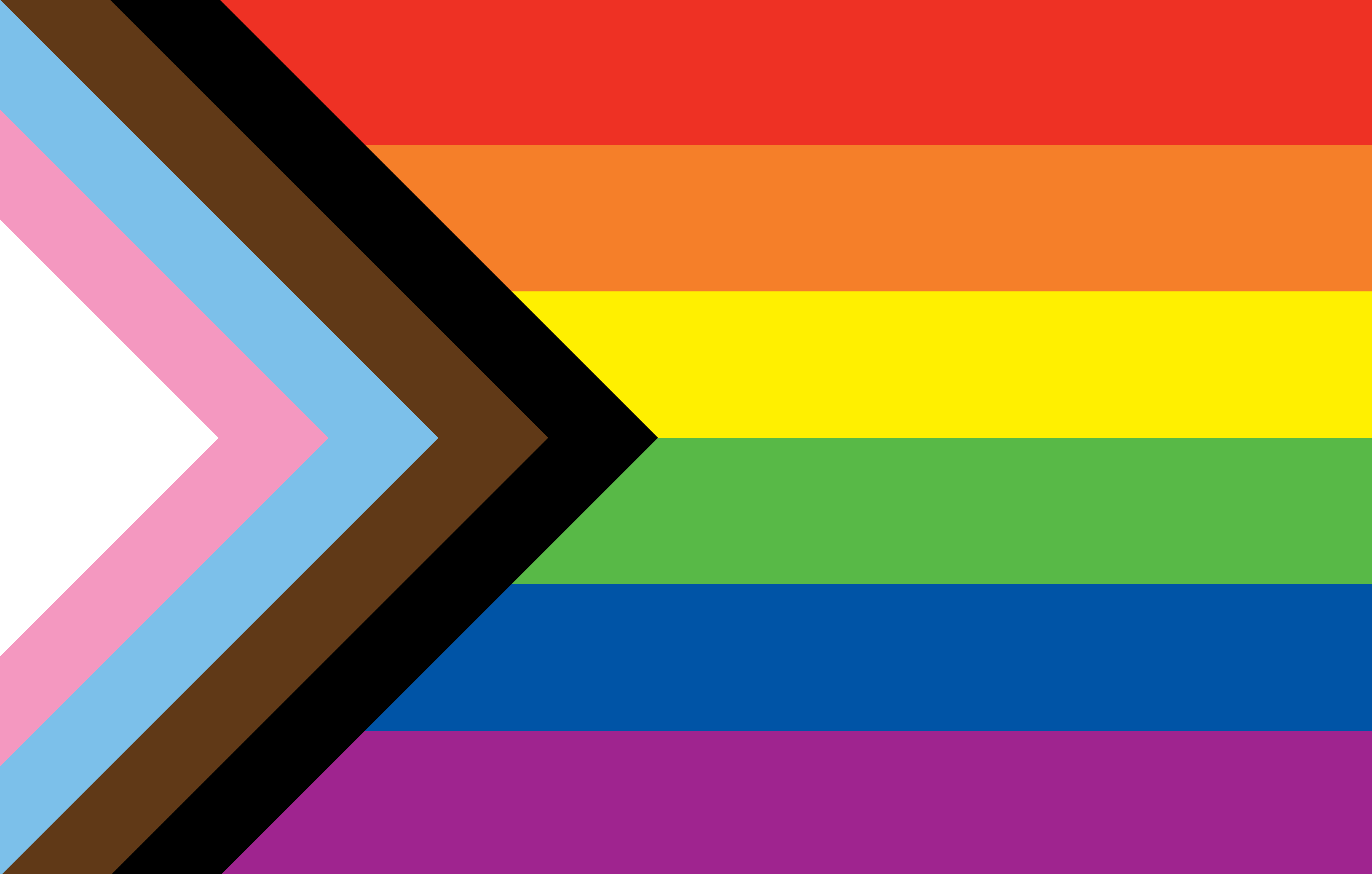
Graphic designer and artist Daniel Quasar (who uses xe/xem pronouns) felt inspired by the Philadelphia Pride flag and, in June 2018, published a Kickstarter to fund production of a new variant of the rainbow flag. Calling xis variant the “Progress” flag, Quasar took the six-striped rainbow flag and added a chevron on the left, pointing towards the right of the flag. The chevron included, from left to right, the white, baby pink, and baby blue of the trans flag, and the brown and black of the Philly Pride flag. Quasar also intended the black stripe to represent “those living with AIDS, those no longer living, and the stigma surrounding them”.
Quasar’s Kickstarter hit its target of $14,000 within days of launching, owing to a slew of news articles and the viral spread of the project through the LGBT+ community. As with the Philly Pride redesign, and despite Quasar’s good intentions to promote inclusivity of marginalised voices within the community, there were detractors for this project as well.

After the end of the campaign, Quasar set up the Progress Initiative as a vehicle to donate a portion of proceeds from merchandise featuring the Progress flag to various charities supporting the LGBT+ community.
These flags may serve as representations of the whole or parts of a community and many people hold deep affinities with one or more of these symbols. It can feel violating when a dearly held symbol is changed, so it is unsurprising that some people mount passionate defences of something they feel represents them. On the other hand, others may feel that change is needed to focus efforts on something new and that a new symbol is the best way to communicate that change in focus to people inside and outside the community.
I think that, whenever modifications to the rainbow flag happen or when entirely new symbols are created, it is vital to take a step back to examine why some people think the change is necessary. Perhaps that way, we can try to be more considerate of some of the marginalised voices within our vast community.
Conor Wilman
IP Out Committee Member
Dehns
PS. For some added IP-related reading, IPKat published an article examining the IP protection of the rainbow flag. Enjoy!
Page published on 21st February 2020
Page last modified on 21st February 2020


21st-02-2020
Great article, thanks for all the research. Who knew?
Helen Jones